
Iron Okami 鉄 狼
.
Iron Okami 鉄 狼 .
Dystopian style, Utopian ethics
↓
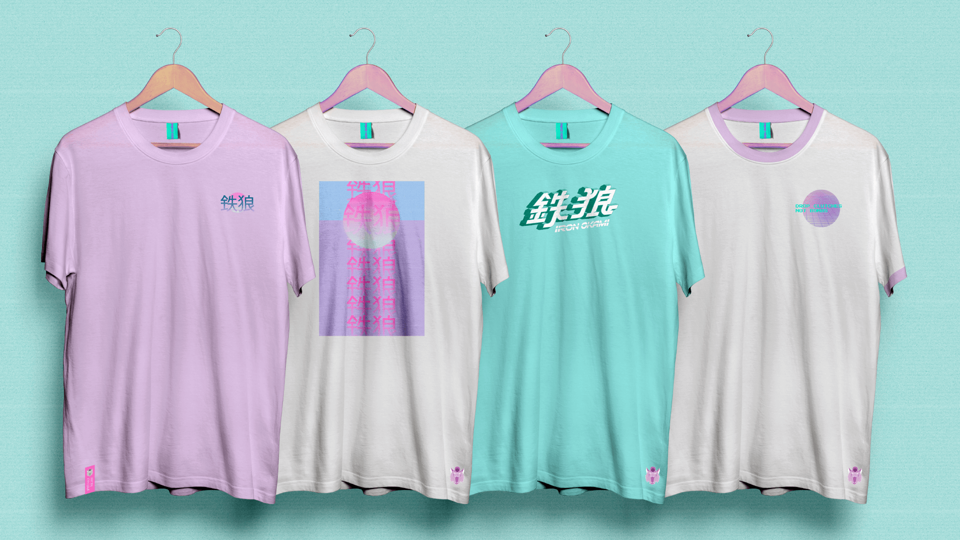
Brand identity design for Iron Okami, a motorcycle fashion brand inspired by vaporwave, videogames and 80s/90s Japanese sports bike culture.
Roles –
Brand identity
Print collateral
Tshirt designs
Iron Okami (Japanese for Wolf) aims to move away from the current and saturated Café Racer/Custom bike scene and instead, take inspiration from 80s and 90s (primarily Japanese) sports bikes and the cultural climate that surrounded these bikes at the time. It is a mix of Japanese tech culture, cyberpunk, vaporwave, cinema and videogames of the 80s and 90s.
Although influenced by dreary visions of the future, the brand is determined not to be a contributing factor. On every level possible, Iron Okami’s products are sustainably sourced and made from materials that do not harm the environment in any way.
The brand identity is a flexible, immersive, storytelling experience, centred around the tagline of “dystopian style, utopian ethics”. The designs are inspired by the word ‘topian’, meaning ‘an imagined state or place’ – and Iron Okami becomes that place.


✶